I’ve been in the traffic game for a long time, and as an SEO, analyzing sessions is a huge part of my role. Thankfully, I have a strong appetite for data, and the tools to make the most of it are my happy place.
This post is to compile tips and share my favorite and most efficient visualization for traffic data. I’ll keep updating it as much as possible with more visualization to cover as many use cases as possible.
Note: For the charts below, I’ll be using real data from one of my personal websites (FR) https://www.coup-de-vieux.fr
The importance of clear titles and legends
Let’s start with what seems the most obvious, but too often, it is unclear what metric we’re looking at or the time range. Is it sessions or pageviews? Organic traffic or total? etc. even for you, it might be obvious now, but will it be in a month?
Moving averages for smoother trends
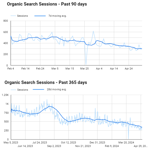
Daily traffic metrics are very volatile, and analyzing a trend can be challenging if you stick to a too granular metric. In many cases, smoothing the data with moving average will make your charts easier to digest and more insightful.
Always keep the daily trend visible; it might not be the star of the visualization, but it is still the leading actor.
Use 7-day moving averages for a short period (< 3 months); otherwise, a 28-day moving average works best. See the difference below:
if you feel like doing both, it is always possible to do so with the right colors so it is not overwhelming.

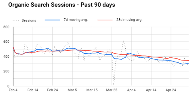
In Looker Studio, you will find the moving average trendline here: Style tab > Trendline > Select “Moving Average” and the period
If you want 2 trendlines, just put one chart without an axis or grid on top of the other.
Previous period comparison
Once again, Looker Studio made this very easy and using the “advanced” options you can customize your comparison to match your needs. For instance, a view I like a lot is the hourly sessions week-over-week. You could compare it to the previous day, of course, but I find it less helpful since not all days are equal (e.g., you can’t compare a Monday to a Sunday).
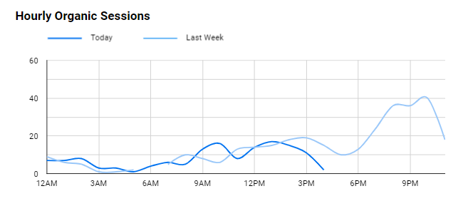
Because I know a “today” view will always have some missing data, I picked “line break” for the “missing data” option in “style” instead of the default “line to zero” which could be scary. I also picked “smooth,” but it doesn’t really matter.
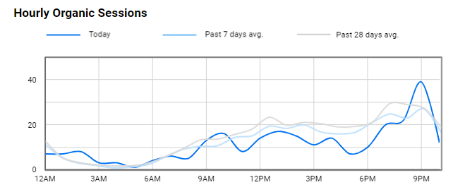
A more fancy version comparing today’s hourly sessions to the past 7 and 28-day averages:
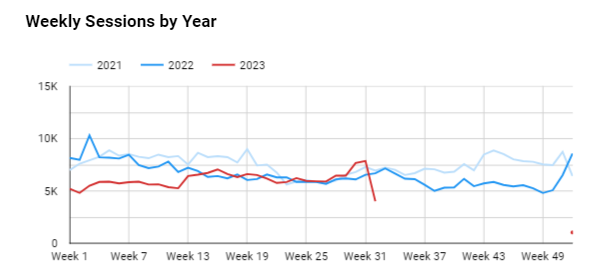
Using a breakdown dimension to compare previous periods works great, too. In the example below, I’m using “Week of the Year” as a dimension and “Year” as a breakdown.
The Final boss
Combining a bit of everything, this is the view I use the most for years in my job. It is especially relevant to show YoY growth and should mitigate seasonality. In a single view, it shows:
- Sessions for the past 365 days: daily, weekly average, and monthly average
- 7-day avg YoY (green bars)
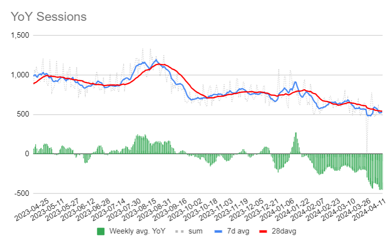
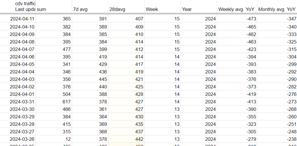
I’m not sure if it is possible to do that exactly in Looker Studio with the default options; the easiest way I found is to schedule a daily export of your daily traffic in Sheets using the Google Analytics Add-on (still looking for a viable GA4 option btw, the official one is not great) and calculate the other metrics. Here’s a screenshot of the source sheet:
Voilà! I hope some of those visualizations and tips will be useful or inspire you to create your own tailored to your needs.
Read Also:
- Data is Beautiful (Reddit)
- The beauty of data visualization (TED talk)
Was this helpful?
1 / 0

SEO/Data Enthusiast
I help international organizations and large-scale websites to grow intent-driven audiences on transactional content and to develop performance-based strategies.
Currently @ZiffDavis – Lifehacker, Mashable, PCMag
ex @DotdashMeredith, @FuturePLC